Phillip (Armand) Bester is a medical scientist, researcher, and lecturer at the Division of Virology, University of the Free State, and National Health Laboratory Service (NHLS), Bloemfontein, South Africa
Andrie de Vries is the author of “R for Dummies” and a Solutions Engineer at RStudio
Recap
In part 2 of this series, we discussed the PhyloPi pipeline for conducting routine HIV phylogenetics in the drug-resistance testing laboratory as a part of quality control. As mentioned, during HIV replication the error-prone viral reverse transcriptase (RT) converts its RNA genome into DNA before it can be integrated into the host cell genome. During this conversion, the enzyme makes random mistakes in the copying process. These mistakes, or mutations, can be deleterious, beneficial or may have no measurable impact on the replicative fitness of the virus. However, the fast rate of mutation provides enough divergence to be useful for phylogenetic analysis.
Introduction
As infections spread from person to person, the virus continues to mutate and become more and more divergent. This allows us to use the genetic information we obtain while doing the drug resistance test and analyse the sequences for abnormalities.
We showed how DNA sequences can be aligned and, based on the composition of ‘columns’ in these strings, a distance matrix can be calculated of each string against each other. In the example we discussed in part 2, we had a very simple method for calculating matches, i.e., we used either a one or zero. We can get closer to the truth by using substitution models, as we will explain below. In many machine learning algorithms, it is required that one first calculate the distances of each observation against each other, and the choice of algorithm is up to the analyst. Phylogenetic inference is very similar in that a distance matrix needs to be constructed on which the tree can be calculated.
If the sequence targeted for phylogenetic inference is very stable with little or no evolution, the distances calculated will be zero or very close to it. This will not allow for differentiation. However, as we mentioned, HIV has a very fast rate of evolution due to its error-prone reverse transcriptase.
Cuevas et al. (2015) published work on the in vivo rate of HIV evolution. Their analysis revealed the highest mutation rate of any biological entity of \(4.1 \cdot 10^{-3}\) (\(sd=1.7 \cdot 10^{-3}\)). However, the error-prone reverse transcriptase is not the only mechanism of mutation. One defence against HIV infection is an enzyme called apolipoprotein B mRNA editing enzyme, catalytic polypeptide-like or APOBEC. These enzymes act on RNA and convert or mutate cytidine to uridine (uridine in RNA is the thymadine counterpart in DNA). This results in a G to A mutation on the cDNA.
Also, shown by Cuevas et al, these enzymes are not equally active in all people. On the other hand, the viral Vif protein inhibits this hypermutation by ‘tagging’ the APOBEC protein with ubiquinone for degradation by the cytoplasmic ubiquitin-dependent proteasome machinery.
But how does this virus-driven mutation, or APOBEC-driven hypermutation, affect the virus in a negative (or positive) way?
We first need to understand how RNA is translated into proteins. Below is a table showing the codon combinations for each of the 20 amino acids.

Figure 1: Amino acid encoding. Available at https://www.biologyjunction.com/protein-synthesis-worksheet/
As can be seen from the table above, some amino acids are encoded by more than one codon. For example, if we change the codon CGU to AGA, the resulting amino acid stays Arginine or R. This is referred to as a silent mutation, since the resulting protein will look the same. On the other hand, if we mutate AGU to CGU, the resulting mutation is from Serine to Arginine, or in single-letter notation, S to R. A change in the amino acid is referred to as a non-synonymous mutation.
Example
In reality, the APOBEC enzyme recognizes specific RNA sequence motifs, but just to give an idea of how this works, let’s look at an example.
Load some packages:
library(ape)
library(Biostrings)
library(tibble)
library(tidyr)
library(dplyr)
library(knitr)
library(plotly)
library(RColorBrewer)
library(diagram)
Create a RNA sequence (remember U is T in RNA language):
WT <- c("CGA", "GUU", "AUA", "GAG", "UGG", "AGU")We have the sequence CGAGUUAUAGAGUGGAGU that we created in the cell block above as codons for clarity. We can now translate this sequence using the codon table or some function.
translate_dna_sequence <- function(x){
  x %>%
    paste0(collapse = "") %>%
    gsub("U", "T", .) %>%
    DNAString() %>%
    as.DNAbin() %>%
    trans() %>%
    .[[1]] %>%
    as.character.AAbin()
}

AA <- WT %>% translate_dna_sequence()
The code block above translated our RNA sequence into a protein sequence: R, V, I, E, W, S.
Now let’s mutate all occurrences of C to U/T:
MUT <- gsub("C", "U", WT)The resulting mutant sequence is: UGA, GUU, AUA, GAG, UGG, AGU, and if we now translate that, we get …
AA <- MUT %>% translate_dna_sequence()… the protein sequence: *, V, I, E, W, S.
The * means a stop codon was introduced. Stop codons are responsible for terminating translation from RNA to protein. If one of the viral genes has a stop codon in it, the protein will truncate prematurely and the protein will most likely be dysfunctional. Mutations other than stop codons could also have a negative effect on the virus, or it can cause resistance to an ARV.
Calculating genetic distances from a multiple sequence alignment (MSA)
In part 2, we showed the general principle of a MSA. In biology, sequence alignments are used to look at similarities of DNA or protein sequences. For most phylogenetic analysis, a multiple sequence alignment is a requirement, and the more accurate the MSA, the more accurate the phylogenetic inference.
First, we read in the multiple sequence alignment file.
# Read in the alignment file
aln <- read.dna('example.aln', format = 'fasta')
Next, we can calculate the distance matrix using the Kimura two-parameter (K80) model. There are various models that can be applied when looking at DNA substitution models. We will use a model based on Markov chains. Remember:
“All models are wrong, but some are useful” - George Box
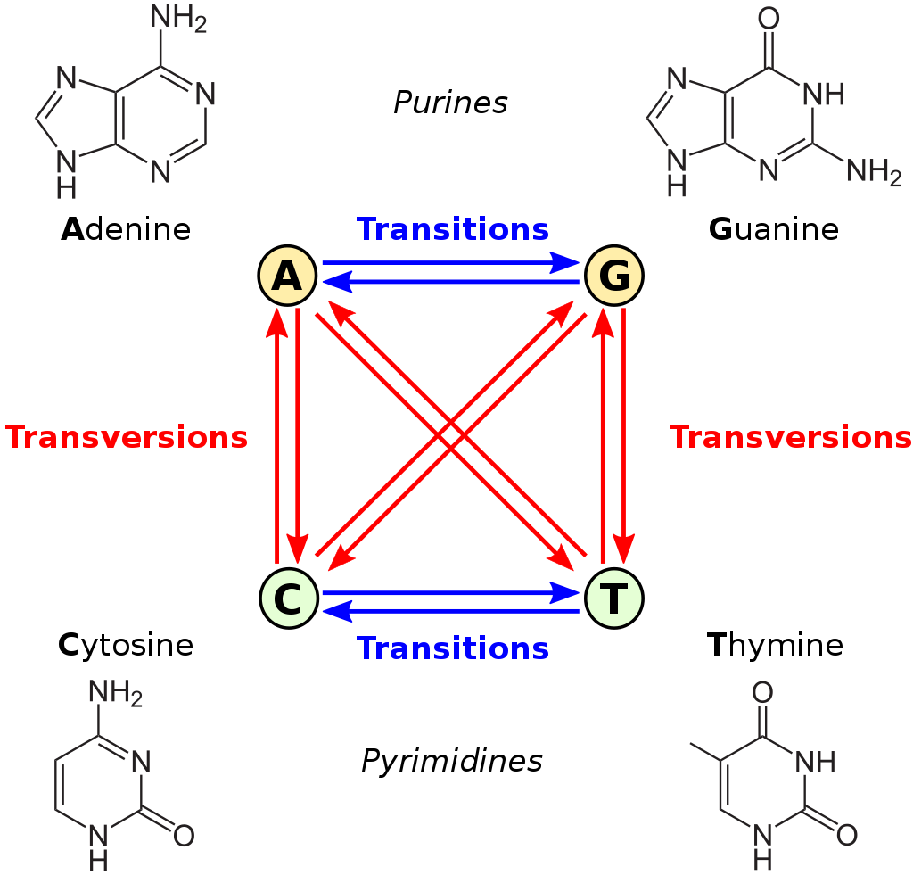
This is very true when it comes to estimating genetic distances and phylogenetic inference. Consider the image below:

Figure 2: transversions vs transitions. Available at https://upload.wikimedia.org/wikipedia/commons/thumb/8/8a/All_transitions_and_transversions.svg/1024px-All_transitions_and_transversions.svg.png
The figure above shows transition and transversion events. Transition between A and G (the purines) and C and T (the pyrimidines) are more likely than transversions (indicated by the red arrows). The K80 model takes this into account as one of its parameters, and these rates, or probabilities, are calculated or estimated by maximum likelihood.
Let’s see what that looks like:
tmDNA <- matrix(c(0.8,0.05,0.1,0.05,
                  0.05,0.8,0.05,0.1,
                  0.1,0.05,0.8,0.05,
                  0.05,0.1,0.05,0.8),
                nrow = 4, byrow = TRUE)
stateNames <- c("A","C","G", "T")
row.names(tmDNA) <- stateNames; colnames(tmDNA) <- stateNames

tmDNA %>%
  kable(
    caption = "Example K80 probabilities of transitions or transversions"
)| A | C | G | T | |
|---|---|---|---|---|
| A | 0.80 | 0.05 | 0.10 | 0.05 |
| C | 0.05 | 0.80 | 0.05 | 0.10 |
| G | 0.10 | 0.05 | 0.80 | 0.05 |
| T | 0.05 | 0.10 | 0.05 | 0.80 |
plotmat(tmDNA,pos = c(2,2),
        lwd = 1, box.lwd = 2,
        cex.txt = 0.8,
        box.size = 0.1,
        box.type = "circle",
        box.prop = 0.5,
        box.col = "light blue",
        arr.length=.1,
        arr.width=.1,
        self.cex = .6,
        self.shifty = -.01,
        self.shiftx = .14,
        main = "Markov Chain")
This example is contrived, but should explain the concept of a substitutions model. The viral reverse transcriptase is not a random sequence generator, but it does make mistakes. Most of the time when it is copying the RNA into DNA, the base (state) stays the same. Then also, the probability of a transversion vs. a transition is different. If you look at the figure above where we introduced transversion and transition, you will notice that A is more similar to G, and T is more similar to C in its chemical structure.
There are many other substitution models. It is not always trivial to select the best model for phylogenetic inference. One technique is to run multiple maximum likelihood phylogenetic calculations using different models, and then pick the model with the lowest AIC (Akaike Information Criterion). For our pipeline, we selected the rather simple K80 model. Since we are looking at different sets of sequences at each submission, a simple model is probably better in order to avoid the problems caused by overfitting.
We can use the ape package and calculate distances using the K80 model.
# Calculate the genetic distances between sequences using the K80 model, as.mattrix makes the rest easier
alnDist <- dist.dna(aln, model = "K80", as.matrix = TRUE)
alnDist[1:5, 1:5] %>%
kable(caption = "First few rows of our distance matrix")| 01_AE.JP.AB253686_INT | B.US.HM450245_INT | B.AU.AF407664_INT | B.CN.KJ820110_INT | B.RU.HM466986_INT | |
|---|---|---|---|---|---|
| 01_AE.JP.AB253686_INT | 0.0000000 | 0.0935626 | 0.0961965 | 0.0962887 | 0.0962887 |
| B.US.HM450245_INT | 0.0935626 | 0.0000000 | 0.0378446 | 0.0378167 | 0.0378748 |
| B.AU.AF407664_INT | 0.0961965 | 0.0378446 | 0.0000000 | 0.0454602 | 0.0494138 |
| B.CN.KJ820110_INT | 0.0962887 | 0.0378167 | 0.0454602 | 0.0000000 | 0.0479955 |
| B.RU.HM466986_INT | 0.0962887 | 0.0378748 | 0.0494138 | 0.0479955 | 0.0000000 |
The matrix has a shape of 47 by 47, so we just preview the first 5 rows and columns.
Reduction of the heatmap to focus on the important data
The pipeline mentioned uses the Basic Local Alignment Search Tool (BLAST) to retrieve previously sampled sequences, and adds these retrieved sequences to the analysis. BLAST is like a search engine you use on the web, but for protein or DNA sequences. By doing this, important sequences from retrospective samples are included, which enables PhyloPi to be aware of past sequences and not just batch-per-batch aware. Have a look at the paper for some examples.
The data we have is ready to use for heatmap plotting purposes, but since the data also contains previously sampled sequences, comparing those sequences amongst themselves would be a distraction. We are interested in those samples, but only compared to the current batch of samples analysed. The figures below should explain this a bit better.

(#fig:distracting data)A diagram of a heatmap with lots of redundant and distracting data.
From the image above you can see that, typical of a heatmap, it is symmetrical on the diagonal. We show submitted vs retrieved samples in both the horizontal and vertical direction. Notice also, annotated as “Distraction”, the previous samples are compared amongst themselves. We are not interested in those samples now, as we would already have acted on any issues then. What we want instead is a heatmap, as depicted in the image below.

(#fig:focussed data)A diagram of a more focussed heatmap with the redundant and distracting data removed.
Fortunately, we have a very powerful tool, R, at our disposal, and plenty of really useful and convenient packages like dplyr to fix this.
alnDistLong <-
  alnDist %>%
  as.data.frame(stringsToFactors = FALSE) %>%
  rownames_to_column(var = "sample_1") %>%
  gather(key = "sample_2", value = "distance", -sample_1, na.rm = TRUE) %>%
  arrange(distance)

alnDistLong %>% head()
## sample_1 sample_2 distance
## 1 01_AE.JP.AB253686_INT 01_AE.JP.AB253686_INT 0
## 2 B.US.HM450245_INT B.US.HM450245_INT 0
## 3 B.AU.AF407664_INT B.AU.AF407664_INT 0
## 4 B.CN.KJ820110_INT B.CN.KJ820110_INT 0
## 5 B.RU.HM466986_INT B.RU.HM466986_INT 0
## 6 B.US.DQ127546_INT B.US.DQ127546_INT 0Final cleanup and removal of distracting data
# get the names of samples originally in the fasta file used for submission
qSample <- names(read.dna("example.fasta", format = "fasta"))

# compute new order of samples, so the new alignment is in the order of the heatmap example
sample_1 <- unique(alnDistLong$sample_1)
new_order <- c(sort(qSample), setdiff(sample_1, qSample))
new_order
## [1] "01_AE.JP.AB253686_INT" "01_AE.TH.JX448243_INT"
## [3] "01_AE.VN.LC100946_INT" "38_BF1.UY.FJ213783_INT"
## [5] "B.AU.AF407664_INT" "B.CN.KJ820110_INT"
## [7] "B.KR.JN417106_INT" "B.RU.HM466986_INT"
## [9] "B.US.DQ127546_INT" "B.US.GU076504_INT"
## [11] "B.US.HM450245_INT" "BC.CN.JQ898256_INT"
## [13] "C.ZA.KT183056_INT" "C.ZM.KM049918_INT"
## [15] "C.ZM.KM050042_INT" "01_AE.TH.JX448252_INT"
## [17] "01_AE.TH.JX448250_INT" "01_AE.TH.JX448249_INT"
## [19] "C.ZA.KT183058_INT" "C.ZM.KM049913_INT"
## [21] "B.KR.JN417120_INT" "B.KR.JN417117_INT"
## [23] "B.KR.JN417116_INT" "57_BC.CN.JX679207_INT"
## [25] "C.ZM.KM050043_INT" "C.ZM.KM050041_INT"
## [27] "01_AE.JP.AB253682_INT" "01_AE.JP.AB253689_INT"
## [29] "B.US.KJ704790_INT" "B.ES.KC238594_INT"
## [31] "B.AU.AF407665_INT" "B.AU.AF407667_INT"
## [33] "B.CN.KC987976_INT" "B.CN.KT192001_INT"
## [35] "B.US.AF040369_INT" "B.US.M38429_INT"
## [37] "B.US.DQ127547_INT" "B.US.DQ127543_INT"
## [39] "C.ZA.KT183062_INT" "B.US.GU076505_INT"
## [41] "B.US.GU076507_INT" "C.ZM.KM049917_INT"
## [43] "01_AE.CN.JQ302565_INT" "01_AE.VN.FJ185234_INT"
## [45] "F1.BR.FJ771006_INT" "BF.AR.AF408631_INT"
## [47] "BC.CN.KC898983_INT"Plot the heatmap using plotly for interactivity
alnDistLong %>%
  filter(
    sample_1 %in% qSample,
    sample_1 != sample_2
    ) %>%
  mutate(
    sample_2 = factor(sample_2, levels = new_order)
  ) %>%
  plot_ly(
    x = ~sample_2,
    y = ~sample_1,
    z = ~distance,
    type = "heatmap", colors = brewer.pal(11, "RdYlBu"),
    zmin = 0.0, zmax = 0.03,  xgap = 2, ygap = 1
) %>%
  layout(
    margin = list(l = 100, r = 10, b = 100, t = 10, pad = 4),
    yaxis = list(tickfont = list(size = 10), showspikes = TRUE),
    xaxis = list(tickfont = list(size = 10), showspikes = TRUE)
  )
Phylogenetic tree
Above we used the package ape to calculate the genetic distances for the heatmap.
Another way of looking at our alignment data is to use phylogenetic inference. The PhyloPi pipeline saves each step of phylogenetic inference to allow the user to intercept at any step. We can use the newick tree file (a text file formatted as newick) and draw our own tree:
tree <- read.tree("example-tree.txt")
plot.phylo(
  tree, cex = 0.8,
  use.edge.length = TRUE,
  tip.color = 'blue',
  align.tip.label = FALSE,
  show.node.label = TRUE
)
nodelabels("This one", 9, frame = "r", bg = "red", adj = c(-8.2,-46))
We have highlighted a node with a red block, with the text “This one”, which we can now discuss. We have three leaves in this node - KM050043, KM050042, KM050041 - and if you would look up these accession numbers at NCBI, you will notice the publication it is tied to:
“HIV transmission. Selection bias at the heterosexual HIV-1 transmission bottleneck”
In this paper, the authors looked at selection bias when the infection is transmitted. They found that in a pool of viral quasi-species, transmission is biased to benefit the fittest viral quasi-species. The node highlighted above shows the kind of clustering one would expect with a study like the one mentioned above. You will also notice plenty of other nodes, which you can explore using the accession number and searching for it here.
The tree above is much like a dendrogram used when displaying agglomerative or hierarchical clustering. The numbers on the tree indicate the probability that the corresponding clusters are correct. The branch lengths indicate the distances between samples. In conjunction with a properly coloured heatmap, this is very useful for finding relevant clusters to investigate. If the reason for close clustering cannot be explained, the tests are repeated.
The importance of phylogenetics
Phylogenetics, and thus genetic distance calculations, are used in many branches of biology. It is one of the quality-control measures at our disposal, but it has been used for the reconstruction of the origin of HIV. You may find the research papers listed below interesting where the authors used phylogenetics to infer the zoonotic origins of HIV.
As another example, in 1998, six foreign medical workers were accused of deliberately infecting hospitalized children with HIV and were sentenced to death in Libya. In 2006, de Oliveira, et al. used phylogenetics to provide evidence that the origin of the HIV strains that infected the children had an evolutionary history in the mid-90s, which was before the health care workers arrived in 1998. The six medics were released in 2007. There is also a very good writeup on the case by Declan Butler. Although probably very emotional, this would be a great movie.
These techniques are also used in criminal convictions. However, the interpretation of this kind of evidence in court cases can be unsafe. The insights of Pillay, et al. should bring this to light.
Summary
In this post we discussed that as infections spread from person to person, the virus continues to mutate and become more and more divergent. This allows using the genetic information we obtain while doing the drug resistance test and analyse the sequences for abnormalities.
We then showed how to compute genetic distance using multiple sequence alignment (MSA) and that it’s possible to model this process as a Markov chain. Then you can view the resulting model as a heatmap or phylogenetic trees.
This finds practical application in diverse situations, for exampling shedding light on the origin of the HIV virus, as well as evidence in legal trials.
What’s next
In the fourth and final part of this series, we will show how we analysed the inter- and intra-patient genetic distances of HIV sequences by logistic regression. This was useful in properly colouring our heatmap explained in this series. See you there!
You may leave a comment below or discuss the post in the forum community.rstudio.com.