Waseem Medhat is a Statistical Programmer and Computational Experimentalist who resides in Alexandria, Egypt
This post takes a closer look at the forest plot that was mentioned in a previous post introducing PSI’s Wonderful Wednesdays events. It describes a custom version of a forest plot with additional bands to visualize heterogeneity between studies in a meta-analysis that was part of a project submitted to the Wonderful Wednesdays challenge hosted by PSI and reviewed by statisticians in the organization. Find more information here. The plot is built with JavaScript using the D3.js library and wrapped in a Shiny app with the help of the R2D3 package.
Background problem
The problem around this visualization is specific to meta-analysis, which is the statistical pooling of the results of multiple studies (e.g. a multi-center clinical trial) to obtain a single, more powerful estimate. The choice of pooling model (fixed effect vs. random effects) depends on the heterogeneity of effect size between studies. So, the main question that I wanted to answer with this visualization is:
“What graphical tools can be used to assess heterogeneity?”
Like any statistical graphic, the purpose of the visualization is to complement the statistical measures of heterogeneity, like I^2^, to give a more complete picture.
Plot description
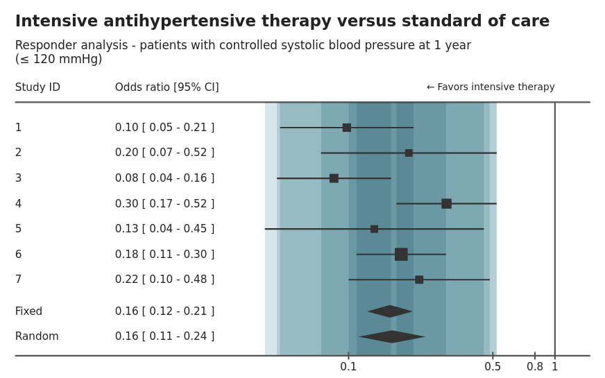
A lot of the plot components are directly comparable to the typical forest plot, which is very popular in the medical field as visualization tool in meta-analyses. Its main features are:
- A square for each point estimate for a study. The square size is proportional to the sample size (i.e. weight) of that study.
- A line for each confidence interval of the effect size in a study.
- Diamonds that represent the pooled estimate using either fixed-effect or random-effects model. The diamond width represents the confidence interval around the pooled estimate.
- The plot is usually combined with a tabular display of the numbers represented by the plot.
My own additions are:
- Colored bands to give a better visualization of the heterogeneity between studies. There is a band for each study, with a width equal to its confidence interval. All the bands are semi-transparent and overlayed over each other so that more overlapping produces darker areas.
- More attention to annotations than the typical plots, providing a title and a subtitle with the interventions and the outcome, respectively. Another label is also added to show which direction represents the “positive” effect.
Shiny app description
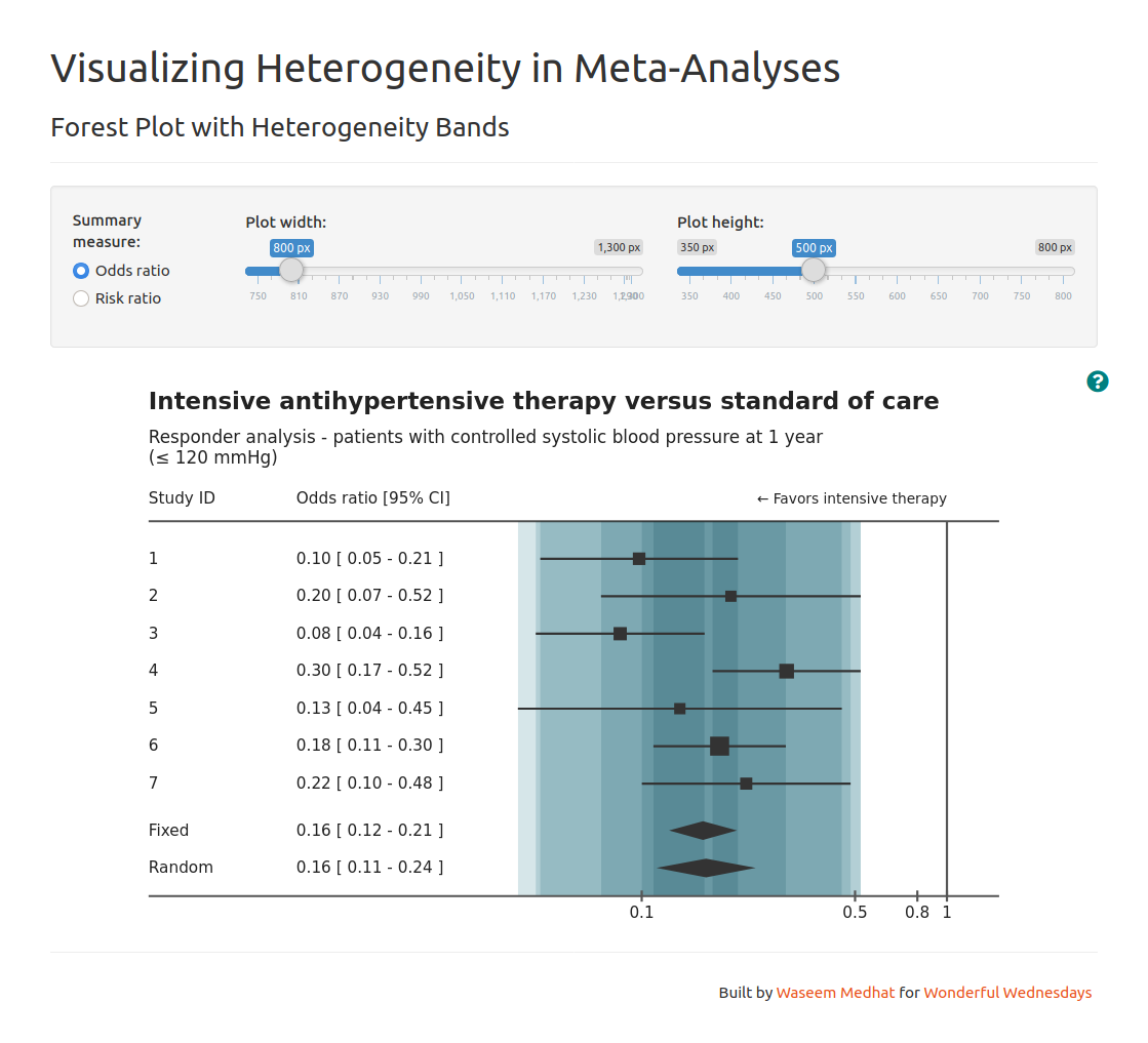
As a proof of concept for a viable product, I wrapped the plot in a Shiny app which provides additional interactive features:
- Selection of summary measure, which can be expanded to include more than the odds ratio and risk ratio.
- Control over the plot dimensions. Giving this control to the user allows the plot to be conveniently visible in different screen sizes and deliverable forms (e.g. a report or a dashboard).
- Help button that shows a guide for interpretation. This makes the information available on-demand instead having it a separate tab.
Technologies and packages
D3.js (JavaScript)
The plot itself (and associated tabular display) was built using D3. Being a JavaScript library, D3 works with web technologies: HTML, CSS, and especially SVG. It has a lot of low-level tools that bind data to SVG shapes and change the shape properties accordingly. One particular advantage of using web technologies in this visualization is that CSS allows semi-transparent elements to “blend” colors in multiple ways, which allowed me to choose a blend mode that emphasizes the overlap.
R2D3
R2D3 was the main wrapper around the D3 visualization. Beside the obvious
advantage of introducing an interface between R and D3 and allowing its
rendering in Shiny, it makes some steps easier like giving the data to the plot and making the plot take as much space as possible inside its container. Because of this, initial variables like data, width, height, and (the container) svg are provided by R2D3 and are not declared in the JavaScript code.
Shiny
It does not need an introduction at this point: Shiny is the de facto standard for R-based web applications. With the R2D3 package, I have available d3Output() and renderD3() to render the D3 plot just like any typical output in Shiny. Other Shiny packages I used are
shinyhelper, which provides a help button and rich modal dialogs for help content, and shinythemes to change the appearance of the app.
By wrapping the visualization in a Shiny app, this project became a prototype that can be taken in a lot of different directions to include more effect sizes and other meta-analysis techniques, or maybe even add another module that imports the data, performs the meta-analysis, and send the results to this module to be visualized.
Links
- Live version of the Shiny app: https://waseem-medhat.shinyapps.io/forest_plot_with_bands/
- GitHub: https://github.com/waseem-medhat/forest_plot_with_bands
- Wonderful Wednesdays December submissions: https://vis-sig.github.io/blog/posts/2020-12-03-wonderful-wednesdays-december-2020/
You may leave a comment below or discuss the post in the forum community.rstudio.com.