Vidisha Vachharajani works in the EdTech industry, where she enjoys developing data-driven strategy solutions for learners. She has been an R user for over 15 years.
As a data professional, I have enjoyed learning and using multiple tools for my workflows. For me, everything used to begin and end with R. Today, SQL is a must-know. Not being able to pull your own custom tables from a warehouse can make things tricky. Then there is tidyverse, the master collection of packages for data science & analytics. As an OG R user, I cannot envision data work without tidyverse.
In this first part of a 2-part article, I want to demonstrate how a data analyst can use one OR the other for the initial stages of data exploration, and then double down on tidyverse, leveraging ggplot2 for a deeper exploration. By no means does this preclude the extensive use of SQL for data wrangling. Rather, this post showcases the wonders of tidyverse (a collection of R packages designed for data science, sharing an underlying design philosophy, grammar, and data structures) and specifically, ggplot2 (the language of elegant graphics) for a SQL user’s benefit.
1. The dataset and the goal
The dataset I am using is clinical. Sourced from the UCI machine learning repo, it is the Diabetes 130-US hospitals for years 1999-2008 Data Set. The dataset is large, ~100K rows and 51 columns in its raw format. It is, however, clean data. For the purpose of this article, in order to show SQL and tidyverse language in tandem, I will split it up into 5 parts, and we will assume that the data is actually available to us in these 5 different pieces, rather than as the whole, cleaned data, since this is typically the case in real life.
I will skip the portion about dbplyr, referring readers to the hyperlinked article that will show you how to actually pull data from a remote database using tidyverse’s dbplyr. Typically, this is done using SQL, butdbplyr allows you to do this within R. Rather, I will focus on the initial stages of data exploration, using both SQL and tidyverse for the same output, while extending the tidyverse portion to include ggplot2 visualization examples, using different plot types for each use case. Note that in each case, you can use SQL first, and then use the SQL output as an input for the ggplot2 visualization.
2. Reading in the data
The data has been split into 5 parts – demographic, medical, hospital visits, outcome, test results. To learn more about the actual data, see here. Each part is connected with the other through a UID that is a concatenation of the patient encounter ID and the patient number (using either one doesn’t work to make the ID unique). Note that all of the analyses in this post will be done at the UID level, rather than patient level.
#rm(list=ls())
library(sqldf)
library(dplyr)
library(readxl)
#library(dbplyr)
library(ggplot2)

data_path <- "./dataset_diabetes/diabetic_data.xlsx"
dem <- read_excel(data_path, "demo")
meds <- read_excel(data_path, "medications")
visits <- read_excel(data_path, "hosp_visits")
y <- read_excel(data_path, "readmissions")
results <- read_excel(data_path, "test_results")
3. Early explorations
Let’s begin using SQL and tidyverse to answer some initial questions related to the dataset. The primary hypothesis for this data is the impact of HbA1c measurement on readmission rates, where “readmission” is our response. We will also answer a number of other questions along the way to understand the data better, using ggplot2 when we can.
3.1 Look at the data
3.1.1 Get some counts
Let’s take a look at medications and get a sample size for it, first using SQL and then R.
sqldf('SELECT * FROM meds where 1=0') # SQL see col names## [1] uid metformin repaglinide
## [4] nateglinide chlorpropamide glimepiride
## [7] acetohexamide glipizide glyburide
## [10] tolbutamide pioglitazone rosiglitazone
## [13] acarbose miglitol troglitazone
## [16] tolazamide examide citoglipton
## [19] insulin glyburide-metformin glipizide-metformin
## [22] glimepiride-pioglitazone metformin-rosiglitazone metformin-pioglitazone
## [25] change diabetesMed
## <0 rows> (or 0-length row.names)sqldf('SELECT uid, metformin, repaglinide, nateglinide, chlorpropamide FROM meds LIMIT 5') # SQL## uid metformin repaglinide nateglinide chlorpropamide
## 1 2278392-8222157 No No No No
## 2 149190-55629189 No No No No
## 3 64410-86047875 No No No No
## 4 500364-82442376 No No No No
## 5 16680-42519267 No No No Nohead(meds, n=5) # dplyr## # A tibble: 5 × 26
## uid metfo…¹ repag…² nateg…³ chlor…⁴ glime…⁵ aceto…⁶ glipi…⁷ glybu…⁸ tolbu…⁹
## <chr> <chr> <chr> <chr> <chr> <chr> <chr> <chr> <chr> <chr>
## 1 22783… No No No No No No No No No
## 2 14919… No No No No No No No No No
## 3 64410… No No No No No No Steady No No
## 4 50036… No No No No No No No No No
## 5 16680… No No No No No No Steady No No
## # … with 16 more variables: pioglitazone <chr>, rosiglitazone <chr>,
## # acarbose <chr>, miglitol <chr>, troglitazone <chr>, tolazamide <chr>,
## # examide <chr>, citoglipton <chr>, insulin <chr>,
## # `glyburide-metformin` <chr>, `glipizide-metformin` <chr>,
## # `glimepiride-pioglitazone` <chr>, `metformin-rosiglitazone` <chr>,
## # `metformin-pioglitazone` <chr>, change <chr>, diabetesMed <chr>, and
## # abbreviated variable names ¹metformin, ²repaglinide, ³nateglinide, …sqldf('SELECT COUNT(uid) FROM meds') # SQL## COUNT(uid)
## 1 101766nrow(meds) # R## [1] 101766How many patients with a diabetes diagnosis, vs respiratory, circulatory, etc.?
sqldf('SELECT primary_diag, COUNT(*) FROM results GROUP BY primary_diag') # SQL## primary_diag COUNT(*)
## 1 circulatory 30437
## 2 diabetes 8757
## 3 other 48149
## 4 respiratory 14423results %>% group_by(primary_diag) %>% count(primary_diag) # R## # A tibble: 4 × 2
## # Groups: primary_diag [4]
## primary_diag n
## <chr> <int>
## 1 circulatory 30437
## 2 diabetes 8757
## 3 other 48149
## 4 respiratory 14423How many women came in through an emergency admission type?
sqldf('SELECT gender, admission_type_id, COUNT(*) AS n FROM dem LEFT JOIN visits USING(uid) WHERE admission_type_id=1 GROUP BY gender') # SQL## gender admission_type_id n
## 1 Female 1 29448
## 2 Male 1 24540
## 3 Unknown/Invalid 1 2visits %>% left_join(dem, by=join_by(uid)) %>% subset(admission_type_id==1) %>% count(gender, admission_type_id) # dplyr## # A tibble: 3 × 3
## gender admission_type_id n
## <chr> <dbl> <int>
## 1 Female 1 29448
## 2 Male 1 24540
## 3 Unknown/Invalid 1 23.1.2 A mosaic plot
Instead of extracting counts manually, let’s use a mosaic plot to get a sense of how 2 count variables are distributed relative to each other. In this case, age and admission type. This plot sheds light into data availability and asymmetric distributions. For example, here, we see that most patients come from emergency, urgent care, or as an elective, and that there is missing or “not available” admission type data. It is important to retain these 2 categories separately, since they mean different things. Note that in the ggplot parameters, I have not yet introduced axes label cleanup, etc.
p0 <- dem %>% left_join(visits, by=join_by(uid)) %>%
  mutate(admission_type=ifelse(admission_type_id==1, "1:Emergency",
                               ifelse(admission_type_id==2, "2:Urgent",
                               ifelse(admission_type_id==3, "3:Elective",
                               ifelse(admission_type_id==4, "4:Newborn",
                               ifelse(admission_type_id==5, "5:Not Available",
                               ifelse(admission_type_id==6, "6:NULL",
                               ifelse(admission_type_id==7, "7:Trauma Center",
                                      "8:Not Mapped")))))))) %>%
  group_by(admission_type, age) %>% summarise(n=n()) %>% mutate(freq = n / sum(n))
ggplot(p0, aes(x=age, y=admission_type)) +
  geom_tile(aes(fill=n)) + scale_fill_gradient(low="white", high="blue")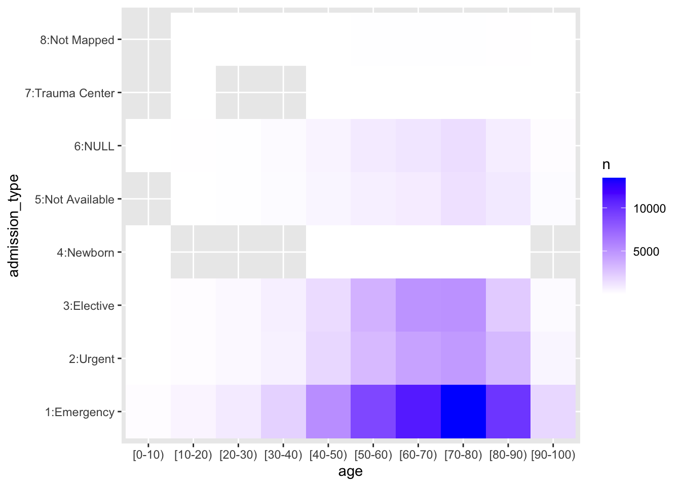
3.1.3 A simple join
Let’s join all 5 datasets and look at it. Note that in SQL, in order to look only at the first few columns, we need to know the column names, which is what we first do here.
# (Output suppressed)
sqldf('SELECT * FROM dem LEFT JOIN visits USING(uid) LEFT JOIN results USING(uid) LEFT JOIN meds USING(uid) LEFT JOIN y USING(uid) where 1=0') # SQL
sqldf('SELECT uid, race, gender, age, weight FROM dem LEFT JOIN visits USING(uid) LEFT JOIN results USING(uid) LEFT JOIN meds USING(uid) LEFT JOIN y USING(uid) LIMIT 5') # SQL## uid race gender age weight
## 1 2278392-8222157 Caucasian Female [0-10) ?
## 2 149190-55629189 Caucasian Female [10-20) ?
## 3 64410-86047875 AfricanAmerican Female [20-30) ?
## 4 500364-82442376 Caucasian Male [30-40) ?
## 5 16680-42519267 Caucasian Male [40-50) ?dem %>% left_join(visits, by=join_by(uid)) %>% left_join(results, by=join_by(uid)) %>% left_join(meds, by=join_by(uid)) %>% left_join(y, by=join_by(uid)) %>% print(n=5) # dplyr, by default shows 10 rows, so we ask it to print 5## # A tibble: 101,766 × 50
## uid race gender age weight admis…¹ disch…² admis…³ time_…⁴ payer…⁵
## <chr> <chr> <chr> <chr> <chr> <dbl> <dbl> <dbl> <dbl> <chr>
## 1 2278392-822… Cauc… Female [0-1… ? 6 25 1 1 ?
## 2 149190-5562… Cauc… Female [10-… ? 1 1 7 3 ?
## 3 64410-86047… Afri… Female [20-… ? 1 1 7 2 ?
## 4 500364-8244… Cauc… Male [30-… ? 1 1 7 2 ?
## 5 16680-42519… Cauc… Male [40-… ? 1 1 7 1 ?
## # … with 101,761 more rows, 40 more variables: medical_specialty <chr>,
## # num_lab_procedures <dbl>, num_procedures <dbl>, num_medications <dbl>,
## # number_outpatient <dbl>, number_emergency <dbl>, number_inpatient <dbl>,
## # diag_1 <chr>, diag_2 <chr>, diag_3 <chr>, number_diagnoses <dbl>,
## # max_glu_serum <chr>, A1Cresult <chr>, primary_diag <chr>, metformin <chr>,
## # repaglinide <chr>, nateglinide <chr>, chlorpropamide <chr>,
## # glimepiride <chr>, acetohexamide <chr>, glipizide <chr>, glyburide <chr>, …3.2 Explore the response: readmissions
3.2.1 Lab procedures
Let’s start with the simplest question – for the primary response variable, “readmitted”, how many lab procedures were done by each category of the response? Note here that “number of lab procedures” is one of a handful of continuous design covariate – rest of the ~45 covariates are all categorical/discrete.
# How many lab tests performed for readmitted patients
sqldf('SELECT readmitted, SUM(num_lab_procedures) AS n FROM visits LEFT JOIN y USING(uid) GROUP BY readmitted') # SQL
## readmitted n
## 1 <30 502275
## 2 >30 1558172
## 3 NO 2325224visits %>% left_join(y, by=join_by(uid)) %>% group_by(readmitted) %>%
summarise(n=sum(num_lab_procedures)) %>% mutate(freq = n / sum(n)) # dplyr, w/ an added proportion ## # A tibble: 3 × 3
## readmitted n freq
## <chr> <dbl> <dbl>
## 1 <30 502275 0.115
## 2 >30 1558172 0.355
## 3 NO 2325224 0.530Since the above doesn’t really tell us much, other than actual counts, proportions by response categories, let’s use ggplot2 to explore the distribution of “number of lab procedures”, using a barplot/histogram approach, with “readmitted” as the fill element. This helps us get a better picture of their relationship; we see here how, for a strikingly normally distributed “number of lab procedures” (other than 1 outlier), on average, the higher the volume of procedures, the more the proportion of readmitted.
# How many lab tests performed for readmitted patients, use ggplot2
p1 <- visits %>% left_join(y, by=join_by(uid))
ggplot(data = p1 ,aes(x=num_lab_procedures,fill=readmitted)) + geom_bar() + labs(x="Number of lab procedures", y="counts") + scale_y_continuous(
    labels = function(n) scales::comma(abs(n)))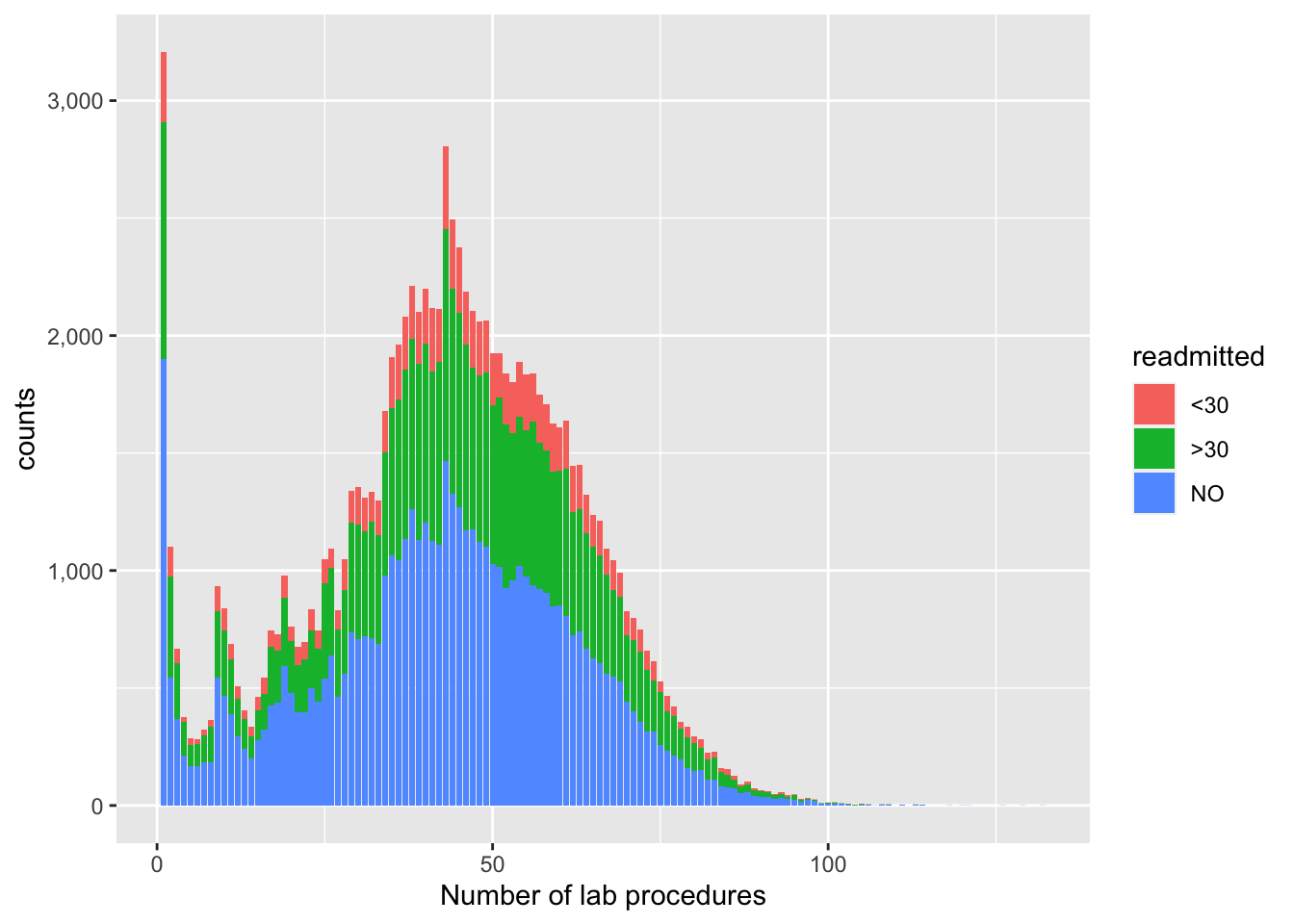
Let’s also do this using ggplot’s beautiful density plots. It is a slightly different type of visual, and tells us how the distribution of X shifts left or right by the response or fill.
ggplot(p1, aes(num_lab_procedures)) + geom_density(aes(fill=factor(readmitted)), alpha=0.8) + labs(x="Number of lab procedures") 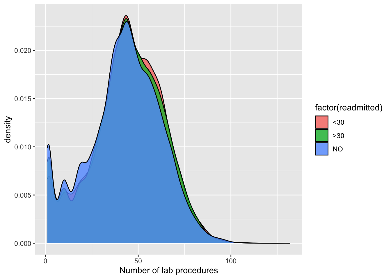
3.2.2 Demographics
Next, we ask how readmissions differ across age groups and gender. Let’s also plot this to understand the output better. We first use a population pyramid approach to get the counts and then barplot the proportions to get a better understanding of the variance in readmissions across these groups.
# What are readmission rates by the different age groups?
sqldf('SELECT age, readmitted, COUNT(*) AS n FROM dem LEFT JOIN y USING(uid) GROUP BY age')  # SQL
## age readmitted n
## 1 [0-10) NO 161
## 2 [10-20) >30 691
## 3 [20-30) NO 1657
## 4 [30-40) NO 3775
## 5 [40-50) NO 9685
## 6 [50-60) >30 17256
## 7 [60-70) NO 22483
## 8 [70-80) >30 26068
## 9 [80-90) NO 17197
## 10 [90-100) NO 2793p21 <- dem %>% left_join(y, by=join_by(uid)) %>% group_by(gender, age, readmitted) %>% summarise(n=n()) %>%
mutate(pct = 100 * n / sum(n), readmission=ifelse(readmitted=="NO", "not readmitted", "readmitted")) %>%
ungroup() %>% subset(gender=="Male"|gender=="Female") %>%
ggplot() +
geom_col(aes(x = ifelse(readmission == "readmitted", -n, n),
y = age,
fill = readmission)) +
facet_wrap(~ gender) +
scale_x_continuous(
labels = function(n) scales::comma(abs(n))) +
xlab("Counts")
p21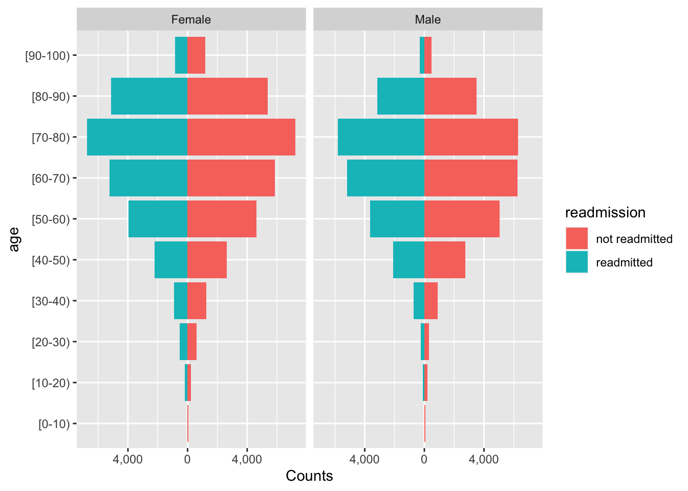
p22 <- dem %>% left_join(y, by=join_by(uid)) %>% group_by(gender, age, readmitted) %>% summarise(n=n()) %>% mutate(freq = n / sum(n)) %>% subset(gender=="Male"|gender=="Female")
ggplot(data=p22, aes(x=age, y=freq, fill=readmitted)) + geom_col() + facet_wrap(~ gender) + labs(y="proportions") + geom_text(aes(label = paste0(round(freq, 4) * 100, "%")), position = position_stack(vjust = 0.5), size=2.5, angle=90) + theme(axis.text.x = element_text(angle=90, vjust=.5, hjust=1))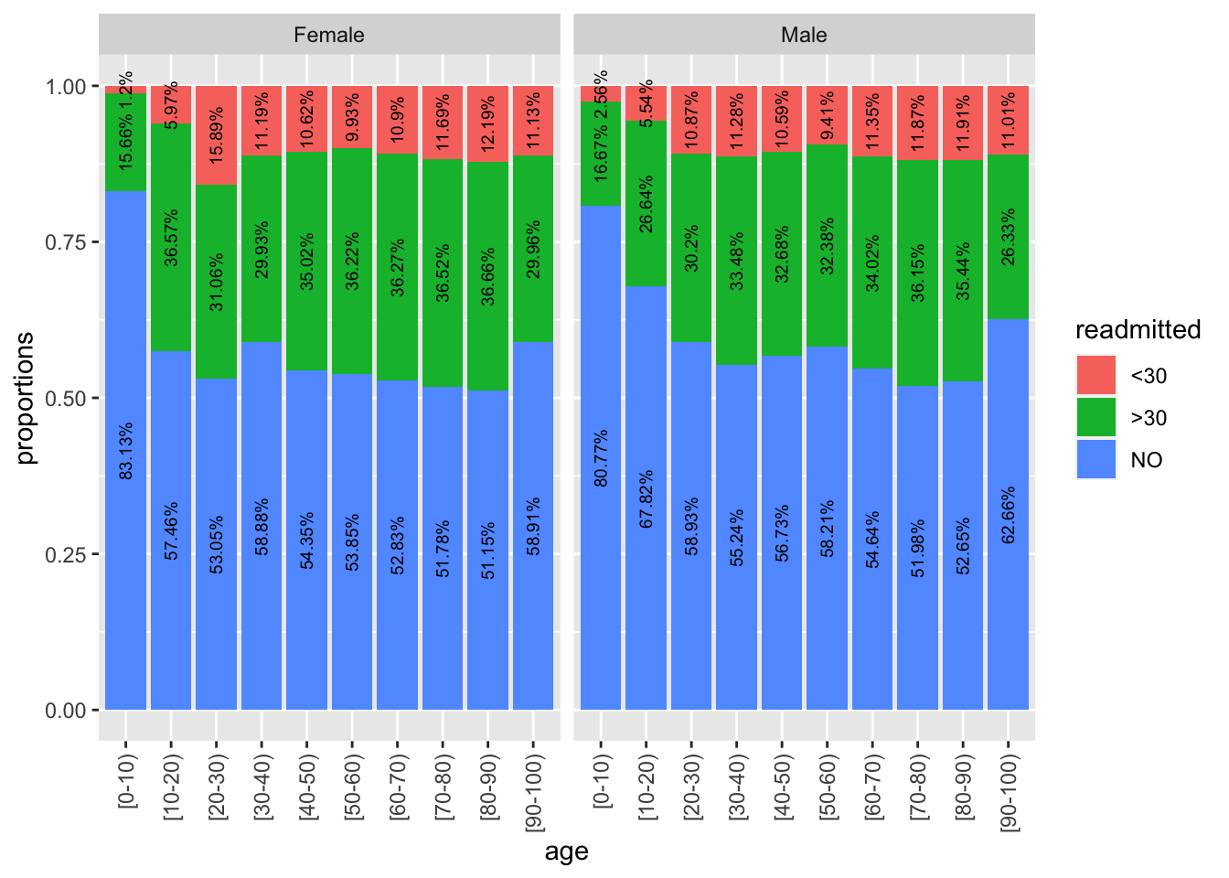
The population pyramid is an intriguing plot type, and already tells us that for most age groups, more women are readmitted. But this could be solely because there are more women than men in the sample. However, from the proportion barchart, we see here that proportion of readmitted women is greater than men, particularly for the 20-30 age group.
3.2.3 Patient diagnoses
Finally, how are readmission rates distributed by patient and patient care features. For example, how is it distributed by patient primary diagnosis? In the final section of this post, we will leverage ggplot2’s visualization power to triangulate patient diagnoses with the key covariate and the response. Like in the previous section, we use proportions, adding the relevant labels to more easily infer that we see higher readmission rates for a diabetes diagnosis.
We change around quite a few of the plotting parameters in ggplot2 to make it look much more eye-catching.
# How is readmitted rate distributed by diagnoses?
sqldf('SELECT primary_diag, readmitted, COUNT(*) as n FROM results LEFT JOIN y USING(uid) GROUP BY primary_diag, readmitted')  # SQL
## primary_diag readmitted n
## 1 circulatory <30 3485
## 2 circulatory >30 10839
## 3 circulatory NO 16113
## 4 diabetes <30 1137
## 5 diabetes >30 3318
## 6 diabetes NO 4302
## 7 other <30 5332
## 8 other >30 15856
## 9 other NO 26961
## 10 respiratory <30 1403
## 11 respiratory >30 5532
## 12 respiratory NO 7488p3 <- results %>% left_join(y, by=join_by(uid)) %>% group_by(primary_diag, readmitted) %>% summarise(n=n()) %>% mutate(freq = n / sum(n))
ggplot(data=p3, aes(x=primary_diag, y=n, fill=readmitted)) + geom_bar(position = "dodge", stat = "identity", color="black") + scale_fill_manual(values=c("#999999", "#E69F00", "#56B4E9")) + theme_minimal() + labs(x="Primary diagnoses", y="Counts (proportions as labels)") + geom_text(aes(label = paste0(round(freq, 4) * 100, "%")), position = position_dodge(width = 1), vjust=-0.7, size=3) + scale_y_continuous(labels = function(n) scales::comma(abs(n)))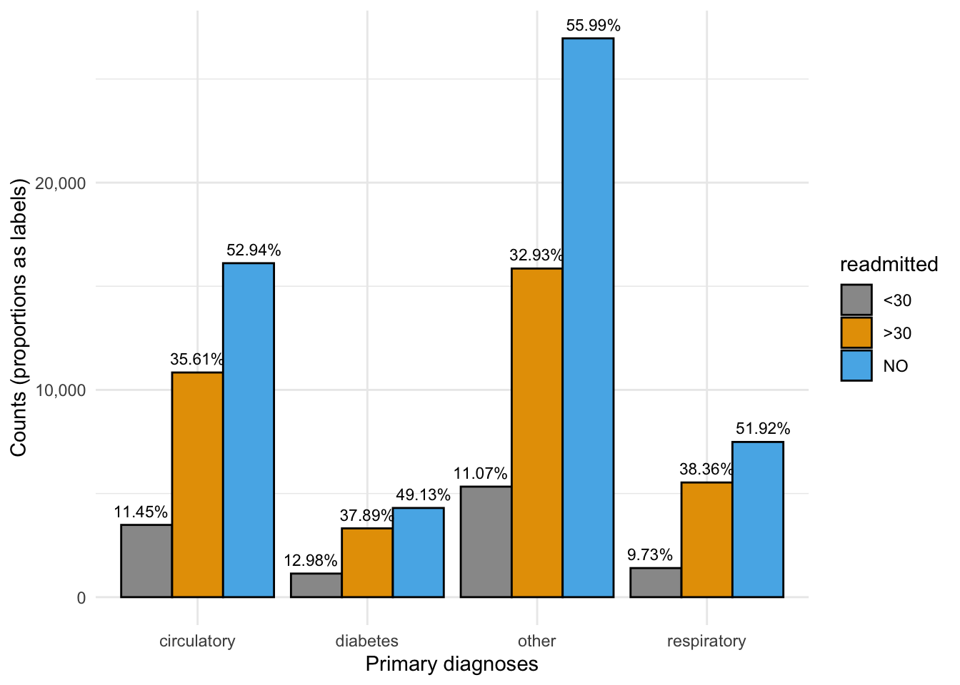
3.2.4 HbA1c measurement
One of the key questions this dataset seeks to answer is the impact of the A1C test (decision to test) on readmission rates, in the presence of covariates (especially the primary diagnosis). Output in its raw form (i.e. untransformed) doesn’t always give us the answer clearly. To get around this, we will use CASE WHEN in SQL and mutate in tidyverse.
Let’s plot this in 2 ways – a barplot with labels, and a spineplot. The latter allows us to see the “weight” of the underlying categories.
# What is the readmission rate profile of patients who had their A1C measured?
sqldf('SELECT CASE WHEN A1Cresult = "None" THEN "not measured" ELSE "measured" END AS a1c, readmitted,
   COUNT(*) FROM results LEFT JOIN y USING(uid) GROUP BY a1c, readmitted ORDER BY 1') # SQL
## a1c readmitted COUNT(*)
## 1 measured <30 1676
## 2 measured >30 5800
## 3 measured NO 9542
## 4 not measured <30 9681
## 5 not measured >30 29745
## 6 not measured NO 45322p4 <- results %>% left_join(y, by=join_by(uid)) %>% mutate(a1c=ifelse(A1Cresult=="None", "not measured", "measured")) %>%
group_by(a1c, readmitted) %>% summarise(n=n()) %>% mutate(freq = n / sum(n))
ggplot(data=p4, aes(x=a1c, y=freq, fill=readmitted)) + geom_col() + labs(x="HbA1c test measurement", y="proportions") + geom_text(aes(label = paste0(round(freq, 4) * 100, "%")), position = position_stack(vjust = 0.5), size=3)# dplyr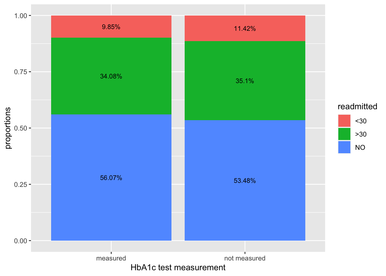
# Spineplot
library(ggmosaic)
p5 <- results %>% left_join(y, by=join_by(uid)) %>% left_join(dem, by=join_by(uid))%>% mutate(a1c=ifelse(A1Cresult=="None", "not measured", "measured")) %>% subset(gender=="Male"|gender=="Female")
per <- p5 %>% group_by(a1c, readmitted) %>% summarise(n=n()) %>% mutate(freq = n / sum(n))
g <- ggplot(p5) + geom_mosaic(aes(x = product(a1c),fill = readmitted))

g + geom_text(data = ggplot_build(g)$data[[1]] %>%
                group_by(x__a1c) %>%
                mutate(pct = .wt/sum(.wt)*100),
              aes(x = (xmin+xmax)/2, y = (ymin+ymax)/2, label=paste0(round(pct, 2), "%")))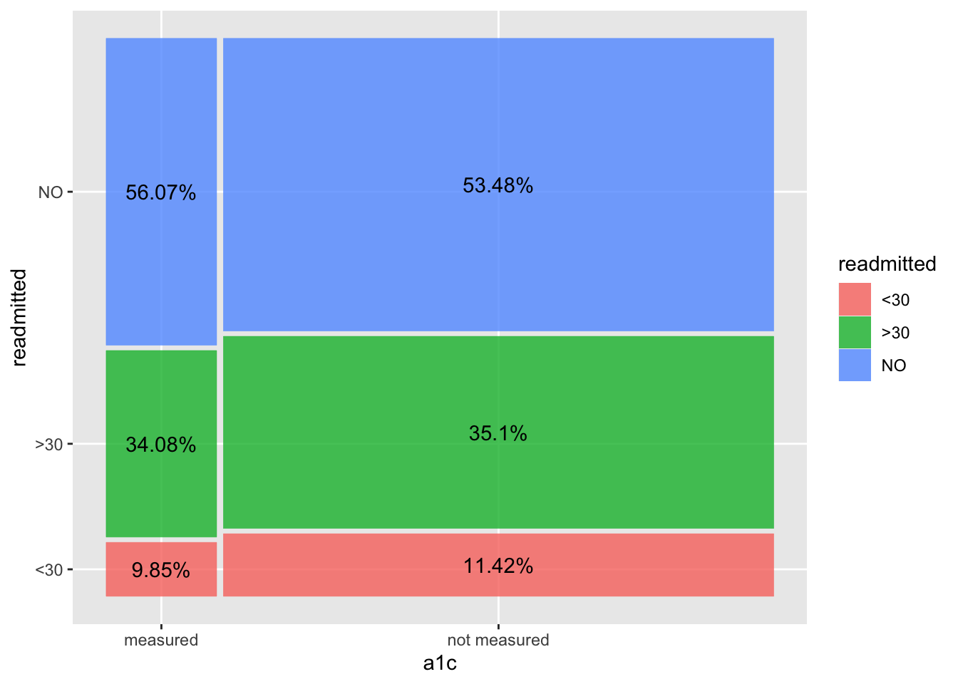
We observe a lower readmission rate (<30 days) when there is an A1C measurement taken, vs when it is not measured at all. In the 2nd/spineplot, we see this without actually calculating the percentages, while also inferring that number of patients not measured is much higher than those measured. We do however, manually add in the percentages to the spineplot to get a more complete picture on the relationship between HbA1c measurement and readmission rates.
These are key findings which we will explore in greater detail, using tidyverse and ggplot2 more extensively, in the next part of this blog series, including cutting these plots across multiple covariates to explore how HbA1c affects readmissions in the presence of other patient groupings. Stay tuned!
You may leave a comment below or discuss the post in the forum community.rstudio.com.