In a previous post, we reviewed how to set up and run a Monte Carlo (MC) simulation of future portfolio returns and growth of a dollar. Today, we will run that simulation many, many, times and then visualize the results.
Our ultimate goal is to build a Shiny app that allows an end user to build a custom portfolio, simulate returns, and visualize the results. If you just can’t wait, a link to the final Shiny app is available here.
This post builds off the work we did previously. I won’t go through the logic again, but the code for building a portfolio, calculating returns, mean and standard deviation of returns, and using them for a simulation is here:
library(tidyquant)
library(tidyverse)
library(timetk)
library(broom)
library(highcharter)

symbols <- c("SPY","EFA", "IJS", "EEM","AGG")

prices <-
  getSymbols(symbols, src = 'yahoo',
             from = "2012-12-31",
             to = "2017-12-31",
             auto.assign = TRUE, warnings = FALSE) %>%
  map(~Ad(get(.))) %>%
  reduce(merge) %>%
  `colnames<-`(symbols)

w <- c(0.25, 0.25, 0.20, 0.20, 0.10)

asset_returns_long <-
  prices %>%
  to.monthly(indexAt = "lastof", OHLC = FALSE) %>%
  tk_tbl(preserve_index = TRUE, rename_index = "date") %>%
  gather(asset, returns, -date) %>%
  group_by(asset) %>%
  mutate(returns = (log(returns) - log(lag(returns)))) %>%
  na.omit()

portfolio_returns_tq_rebalanced_monthly <-
  asset_returns_long %>%
  tq_portfolio(assets_col  = asset,
               returns_col = returns,
               weights     = w,
               col_rename  = "returns",
               rebalance_on = "months")

mean_port_return <-
  mean(portfolio_returns_tq_rebalanced_monthly$returns)

stddev_port_return <-
  sd(portfolio_returns_tq_rebalanced_monthly$returns)


simulation_accum_1 <- function(init_value, N, mean, stdev) {
    tibble(c(init_value, 1 + rnorm(N, mean, stdev))) %>%
    `colnames<-`("returns") %>%
    mutate(growth =
             accumulate(returns,
                        function(x, y) x * y)) %>%
    select(growth)
}
That code allows us to run one simulation of the growth of a dollar over the next 10 years, with the simulation_accum_1() that we built for that purpose. Today, we will review how to run 51 simulations, though we could choose any number (and our Shiny application allows an end user to do just that).
First, we need an empty matrix with 51 columns, an initial value of $1, and intuitive column names.
We will use the rep() function to create 51 columns with a 1 as the value, and set_names() to name each column with the appropriate simulation number.
sims <- 51
starts <-
  rep(1, sims) %>%
  set_names(paste("sim", 1:sims, sep = ""))
Take a peek at starts to see what we just created, and how it can house our simulations.
head(starts)sim1 sim2 sim3 sim4 sim5 sim6
1 1 1 1 1 1 tail(starts)sim46 sim47 sim48 sim49 sim50 sim51
1 1 1 1 1 1 51 columns, with a value of 1 in one row. This is where we will store the results of the 51 simulations.
Now, we want to apply simulation_accum_1 to each of the 51 columns of the starts matrix, and we will do that using the map_dfc() function from the purrr package.
map_dfc() takes a vector - in this case, the columns of starts - and applies a function to it. By appending dfc() to the map_ function, we are asking the function to store each of its results as the column of a data frame (map_df() does the same thing, but stores results in the rows of a data frame). After running the code below, we will have a data frame with 51 columns, one for each of our simulations.
We also need to choose how many months to simulate (the N argument to our simulation function) and supply the distribution parameters as we did before. We do not supply the init_value argument because the init_value is 1, that same 1 that is already in the 51 columns.
monte_carlo_sim_51 <-
  map_dfc(starts,
          simulation_accum_1,
          N = 120,
          mean = mean_port_return,
          stdev = stddev_port_return)

tail(monte_carlo_sim_51 %>%  select(growth1, growth2,
                                    growth49, growth50), 3)
# A tibble: 3 x 4
growth1 growth2 growth49 growth50
<dbl> <dbl> <dbl> <dbl>
1 1.81 1.38 2.32 1.80
2 1.84 1.37 2.38 1.84
3 1.82 1.33 2.39 1.82Have a look at the results. We now have 51 simulations of the growth of a dollar, and we simulated that growth over 120 months; however, the results are missing a piece that we need for visualization, namely a month column.
Let’s add that month column with mutate() and give it the same number of rows as our data frame. These are months out into the future. We will use mutate(month = seq(1:nrow(.))), and then clean up the column names. nrow() is equal to the number of rows in our object. If we were to change to 130 simulations, that would generate 130 rows, and nrow() would be equal to 130.
monte_carlo_sim_51 <-
  monte_carlo_sim_51 %>%
  mutate(month = seq(1:nrow(.))) %>%
  select(month, everything()) %>%
  `colnames<-`(c("month", names(starts))) %>%
   mutate_all(funs(round(., 2)))

tail(monte_carlo_sim_51 %>%  select(month, sim1, sim2,
                                    sim49, sim50), 3)
# A tibble: 3 x 5
month sim1 sim2 sim49 sim50
<dbl> <dbl> <dbl> <dbl> <dbl>
1 119 2.16 1.81 1.46 2.32
2 120 2.28 1.84 1.46 2.38
3 121 2.26 1.82 1.46 2.39We have accomplished our goal of running 51 simulations, and could head to data visualization now, but let’s explore an alternative method using the the rerun() function from purrr. As its name implies, this function will “rerun” another function, and we stipulate how many times to do that by setting .n = number of times to rerun. For example to run the simulation_accum_1 function 5 times, we would set the following:
monte_carlo_rerun_5 <-
  rerun(.n = 5,
      simulation_accum_1(1,
                        120,
                        mean_port_return,
                        stddev_port_return))
That returned a list of 5 data frames, or 5 simulations. We can look at the first few rows of each data frame by using map(..., head).
map(monte_carlo_rerun_5, head)[[1]]
# A tibble: 6 x 1
growth
<dbl>
1 1
2 0.983
3 0.965
4 0.946
5 0.967
6 0.962
[[2]]
# A tibble: 6 x 1
growth
<dbl>
1 1
2 0.980
3 0.975
4 0.964
5 0.969
6 0.914
[[3]]
# A tibble: 6 x 1
growth
<dbl>
1 1
2 1.03
3 0.997
4 0.979
5 1.04
6 1.04
[[4]]
# A tibble: 6 x 1
growth
<dbl>
1 1
2 0.974
3 0.962
4 0.943
5 0.942
6 0.963
[[5]]
# A tibble: 6 x 1
growth
<dbl>
1 1
2 0.990
3 1.02
4 1.06
5 1.12
6 1.13 Let’s consolidate that list of data frames to one tibble. We start by collapsing to vectors with simplify_all(), then add nicer names with the names() function and finally coerce to tibble with as_tibble(). Let’s run it 51 times to match our previous results.
reruns <- 51

monte_carlo_rerun_51 <-
rerun(.n = reruns,
      simulation_accum_1(1,
                        120,
                        mean_port_return,
                        stddev_port_return)) %>%
  simplify_all() %>%
  `names<-`(paste("sim", 1:reruns, sep = " ")) %>%
  as_tibble() %>%
  mutate(month = seq(1:nrow(.))) %>%
  select(month, everything())

tail(monte_carlo_rerun_51 %>%  select(`sim 1`, `sim 2`,
                                    `sim 49`, `sim 50`), 3)
# A tibble: 3 x 4
`sim 1` `sim 2` `sim 49` `sim 50`
<dbl> <dbl> <dbl> <dbl>
1 1.99 1.97 3.66 2.20
2 2.00 1.86 3.68 2.25
3 2.02 1.95 3.78 2.18Now we have two objects holding the results of 51 simulations, monte_carlo_rerun_51 and monte_carlo_sim_51.
Each has 51 columns of simulations and 1 column of months. Note that we have 121 rows because we started with an initial value of 1, and then simulated returns over 120 months.
Now let’s get to visualization with ggplot() and visualize the results in monte_carlo_sim_51. The same code flows for visualization would also apply to monte_carlo_rerun_51, but we will run them for only monte_carlo_sim_51 here.
We start with a chart of all 51 simulations, and assign a different color to each one by setting ggplot(aes(x = month, y = growth, color = sim)). ggplot() will automatically generate a legend for all 51 time series, but that gets quite crowded. We will suppress the legend with theme(legend.position = "none").
monte_carlo_sim_51 %>%
  gather(sim, growth, -month) %>%
  group_by(sim) %>%
  ggplot(aes(x = month, y = growth, color = sim)) +
  geom_line() +
  theme(legend.position="none")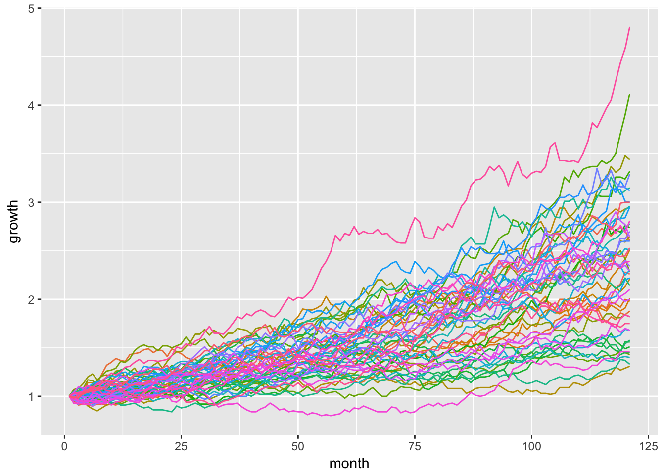
We can check the minimum, maximum and median simulation with the summarise() function here.
sim_summary <-
  monte_carlo_sim_51 %>%
  gather(sim, growth, -month) %>%
  group_by(sim) %>%
  summarise(final = last(growth)) %>%
  summarise(
    max = max(final),
    min = min(final),
    median = median(final))
sim_summary
# A tibble: 1 x 3
max min median
<dbl> <dbl> <dbl>
1 4.81 1.31 2.3We can clean up our original visualization by including only the max, min and median that were just calculated.
monte_carlo_sim_51 %>%
  gather(sim, growth, -month) %>%
  group_by(sim) %>%
  filter(
    last(growth) == sim_summary$max ||
      last(growth) == sim_summary$median ||
      last(growth) == sim_summary$min) %>%
  ggplot(aes(x = month, y = growth)) +
geom_line(aes(color = sim)) 
Now let’s port our results over to highcharter, but in a major departure from our usual code flow, we will pass a tidy tibble instead of an xts object.
Our first step is to convert the data from wide to long tidy format with the gather() function.
mc_gathered <-
  monte_carlo_sim_51 %>%
  gather(sim, growth, -month) %>%
  group_by(sim)

head(mc_gathered)
# A tibble: 6 x 3
# Groups: sim [1]
month sim growth
<dbl> <chr> <dbl>
1 1 sim1 1
2 2 sim1 0.99
3 3 sim1 1.01
4 4 sim1 1.06
5 5 sim1 1.08
6 6 sim1 1.1 We can now pass this tibble directly to the hchart() function, specify the type of chart as line, and then work with a similar grammar to ggplot(). The difference is we use hcaes, which stands for highcharter aesthetic, instead of aes.
# This takes a few seconds to run
hchart(mc_gathered,
       type = 'line',
       hcaes(y = growth,
             x = month,
             group = sim)) %>%
  hc_title(text = "51 Simulations") %>%
  hc_xAxis(title = list(text = "months")) %>%
  hc_yAxis(title = list(text = "dollar growth"),
           labels = list(format = "${value}")) %>%
  hc_add_theme(hc_theme_flat()) %>%
  hc_exporting(enabled = TRUE) %>%
  hc_legend(enabled = FALSE)
We just plotted 51 lines in highcharter using a tidy tibble. For tidy data fans out there, this is a big deal because we can stay in the grammar of the tidyverse but also use highcharter.
Very similar to what we did with ggplot, let’s isolate the maximum, minimum and median simulations and save them to an object called mc_max_med_min.
mc_max_med_min <-
  mc_gathered %>%
  filter(
      last(growth) == sim_summary$max ||
      last(growth) == sim_summary$median ||
      last(growth) == sim_summary$min) %>%
  group_by(sim)
Now we pass that filtered object to hchart().
hchart(mc_max_med_min,
       type = 'line',
       hcaes(y = growth,
             x = month,
             group = sim)) %>%
  hc_title(text = "Min, Max, Median Simulations") %>%
  hc_xAxis(title = list(text = "months")) %>%
  hc_yAxis(title = list(text = "dollar growth"),
           labels = list(format = "${value}")) %>%
  hc_add_theme(hc_theme_flat()) %>%
  hc_exporting(enabled = TRUE) %>%
  hc_legend(enabled = FALSE)
That concludes our visualization of Monte Carlo simulations.
You may leave a comment below or discuss the post in the forum community.rstudio.com.